Create a useful, beautiful, and easy-to-use system
What approach did you take when creating your application? Did you focus solely on functionality and figure you’d worry about the user interface and experience later? Did later never come? Because developers often need to develop or add additional functionality to products quickly, the role design plays in the creation of applications is often forgotten. Don’t make the same mistake. The visual appeal of your application is your first opportunity to make a lasting impact on your users. Let’s take a look at some of the user interface design trends that will allow you to make the most of that first impression and stand out from other applications.
1. Microinteractions
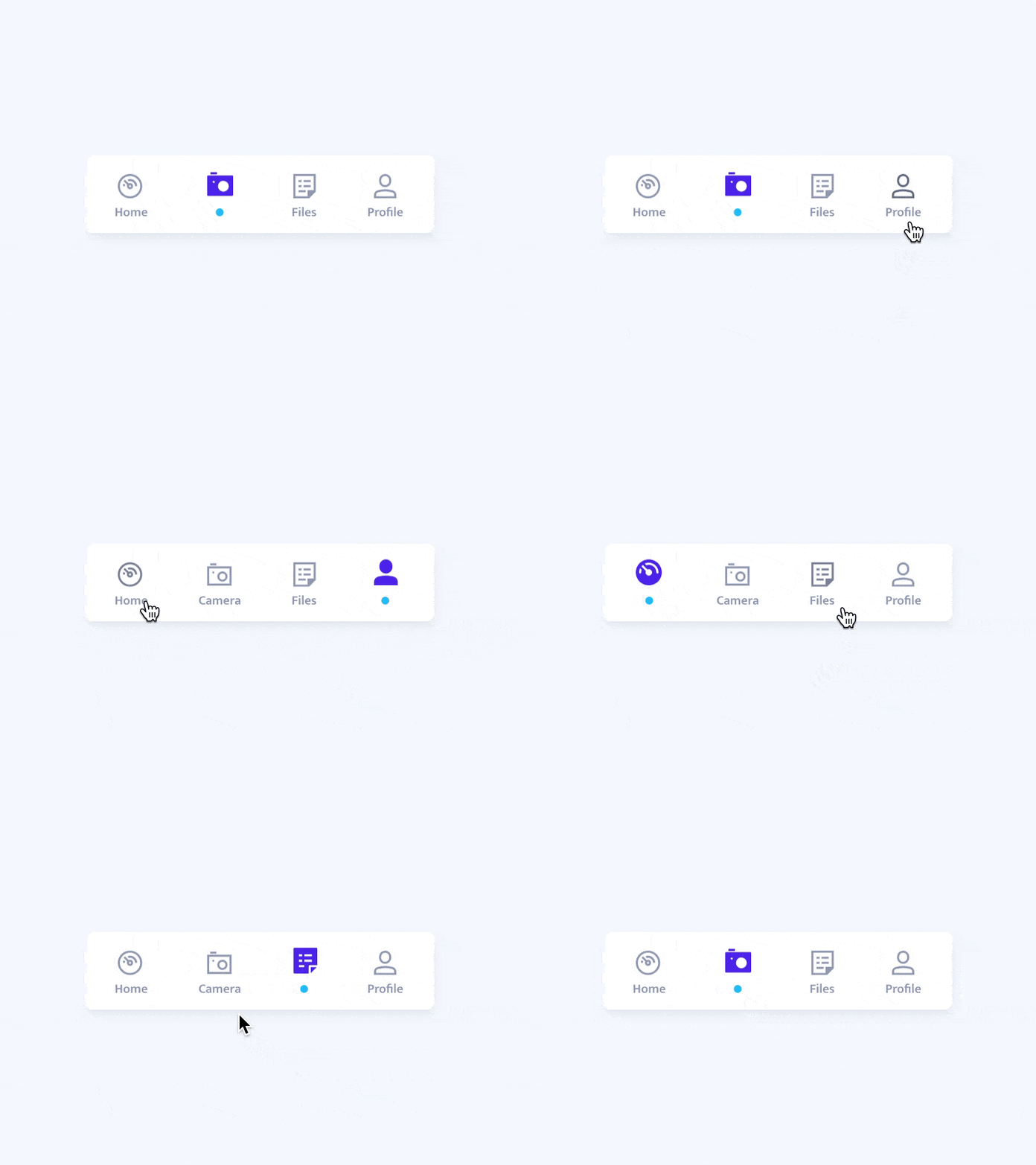
While overlooked by many, microinteractions play an essential role in a user’s experience and are the perfect proof that details really do make the design. You’ll notice these interactions in almost every major app and website you visit. Facebook’s “Like” feature is a great example. Hovering over the Like button will display animated versions of the different types of a “like” a user can give. Microinteractions are subtle and you may not notice them, but if they’re removed, you’ll feel like something important is missing.
2. Skeuomorphic Design
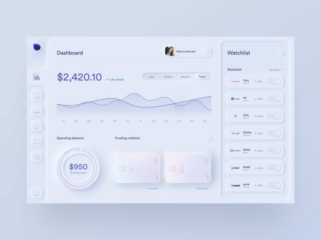
Skeuomorphic design refers to the creation of elements in a realistic style. While this type of design was put to rest years ago, the popularity of VR/AR technology is welcoming it back, albeit with a modern twist. When done correctly, the results are absolutely stunning, but you should consider the time, effort, and incredible focus on details needed before diving head first into this trend. The excessive amount of work can make the style not worth it for an application that is constantly changing and evolving.
3. Asymmetrical Layouts
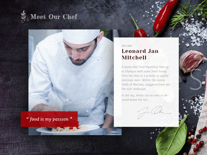
It’s time to release your grip on those perfectly tidy and traditional grid layouts and say hello to overlapping elements. Asymmetrical doesn’t mean random; rather it means you’ve placed your elements in an unusual way that is still aesthetically pleasing. Choose images, text, and other elements that your users will respond to and place them in a way that guides users through your design. You’ll also want to include a generous amount of white space to be successful.
4. Simplicity
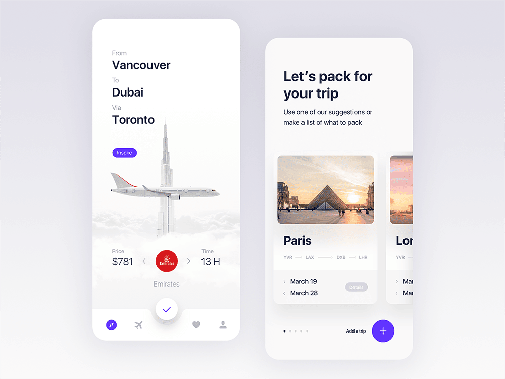
Minimalism comes and goes in the design world, but right now it’s in. While not exactly a trend and more of a group of principles to follow, the focus of a simple design is functionality. In this style, you’ll notice bold typography, minimal color palettes, and plenty of white space. Simplicity requires a thoughtful and deliberate approach. Because of the style, there won’t be many, if any, places to hide a design mistake. However, the results are worth it, offering an elegant and high-quality feeling that can be hard to match.
5. Responsive Colors
Your branding is important. I’m sure you have a list of fonts, sizes, colors, and ways to handle your logo and other image assets. This isn’t a new trend, but brands are now adopting it more and more. Instead of owning a single color for your brand, allow the color to change in the context of what part of your brand it represents. Try putting together a number of predefined colors that can be assigned to different parts of your environment.

6. Typography
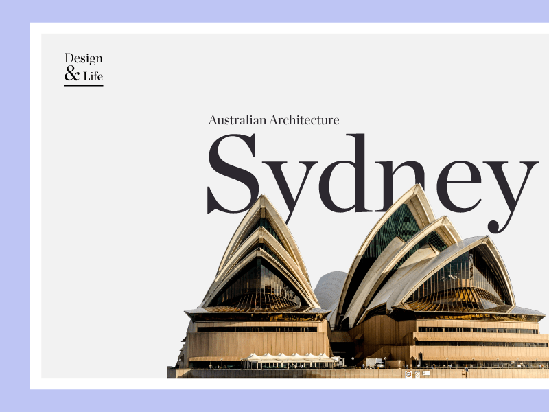
Large text makes a statement. And an interesting change in user interface design is the gradual return of serif fonts. Previously, screen resolution was so low that a font with serifs was considered too difficult to read. With screen resolution improving year after year, that excuse is out the window, opening the door to use thousands of beautiful new typefaces.
7. Dark Themes
No, not ominous undertones—we’re talking color palette. These themes have been around for years, but when Apple recently added one in their Mojave update, the style took off. The key to designing a successful dark theme? Don’t start with a full black background and white text. Begin with darker grays in the background and lighter grays for text, saving white for something that really needs to pop. A side bonus for this style is that with less bright white to stare at, a dark theme can lessen eye strain for your users.

The best UI trends are not only fun to look at, they also improve the overall experience and usefulness of a product. As more and more brands adopt these trends, they shift from being a trend to a design standard. Take a look at your applications today to see which of these trends you can apply—and then take your interfaces to the next level.
If you want to modernize your UI, Synergex has tools and other resources to help you get there. Learn more about our open-source Harmony Core solution, or contact an account executive to find out how our software development consultants with our Professional Services Group can assist you.


1 Comment
you are doing such a great job ! Thank you for sharing the good content . keep it up